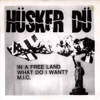
As you can see from the following images, Hüsker Dü had a very identifiable typeface which they used for the logo on all their releases. This was also regularly accompanied by a sans-serif typeface such as Helvetica and very stark contrasts in colour.
These features are ones that are also found in aspects of modernist graphic design, for example artists such as Josef Müller Brockmann and Experimental Jetset


No comments:
Post a Comment