Bibliograhy


Anon, Armin Hoffman, his work, quest and philosophy (1989) – designers books. Available at: http://www.designers-books.com/?p=2596 [Accessed October 13, 2011a].
Anon, History - Trojan. Available at: http://www.trojanrecords.com/history [Accessed September 23, 2011b].
Anon, Husker Du Annotated Discography/Commercial Releases. Available at: http://www.thirdav.com/hd_discog/01_commercial.html [Accessed September 22, 2011c].
Azerrad, M., 2003. Our Band Could be Your Life: Scenes from the American Indie Underground 1981-1991 New edition., Little, Brown & Company.
Balius, A., 2003. Type at Work: The Use of Type in Editorial Design, BIS Publishers B.V.
Books, P., 2006. Music Graphics, PIE Books.
Destruct, B., 2002. Los Logos: Logo-Collection, Die Gestalten Verlag.
Earles, A., 2010. Husker Du: What’s Going on, Voyageur Press Inc.
Frears, S., 2000. High Fidelity,
Hollis, R., 2006. Swiss Graphic Design: The Origins and Growth of an International Style, 1920-1965, Yale University Press.
Holt, M. & Muir, H., 2005. 8vo - On the Outside, Lars Muller Publishers.
Hornby, N., 2005. High Fidelity New Ed., Penguin.
Intro, 2000. Sampler 2: Art, Pop and Contemporary Music Graphics First Edition., Laurence King Publishing.
King, E. & York, P., 2003. Designed by Peter Saville, Frieze.
Levinson, B., 1982. Diner,
Lynskey, D., 2011. 33 Revolutions Per Minute, Faber and Faber.
Mueller-Brockmann, J., 2009. The Graphic Artist and His Design Problems: Gestalterische und erzieherische Probleme in der Werbegrafik-die Ausbildung des Grafikers 3rd ed., Niggli Verlag.
Otomo, K., 2009. Akira Volume 1 (Akira, KODANSHA.
Press, T.P. & Press, P., 2006. Special Packaging + CD ROM, Pepin Press.
Rivers, C., 2008. Best of Disc Art 1: Innovation in Cd, Dvd & Vinyl Packaging Design: v. 1 illustrated edition., Rotovision.
Roberts, L. & Thrift, J., 2005. The Designer and the Grid illustrated edition., Rotovision.
Smith, C., 2009. 101 Albums that Changed Popular Music, OUP USA.
Spencer, H., 2004. Pioneers of Modern Typography Rev. ed., Lund Humphries Publishers Ltd.
Thompson, D., 2002. The Music Lover’s Guide to Record Collecting illustrated edition., Backbeat Books.
Triggs, T., 2003. The Typographic Experiment: Radical Innovation in Contemporary Type Design, Thames & Hudson.
Turcotte, B.R. & Woods, D., 2007. Punk Is Dead: Punk Is Everything! First., Gingko Press.
Winterbottom, M., 2002. 24 Hour Party People,

Evaluation


GDA Practice One

Evaluation

Initially I found the freedom of being given a choice on what to design difficult and confusing. I had to find something that I could put my full attention towards without losing sight of the details in the brief.  The record box set was an idea that captures one of my strongest interests; music and the act of collecting it in the form or vinyl records.
Is it so wrong, wanting to be at home with your record collection? It's not like collecting records is like collecting stamps, or beermats, or antique thimbles. There's a whole world in here, a nicer, dirtier, more violent, more peaceful, more colorful, sleazier, more dangerous, more loving world than the world I live in.
Hornby 1995, p. 83

This quote from High Fidelity sums up the angle I was approaching when developing the idea for the project. I had to design packaging that a collector with an interest in Hüsker Dü would jump at the chance to purchase, even if they already owned the individual records included in the box set. I had to create a true collectors box set and to do that I needed to provide something more than repackaging existing music.  
I felt that producing something of such a high standard was a hard goal to achieve. Successful vinyl box sets are something that collectors desire; not only because of the content. The appearance has to meet approval from potential buyers as well as remaining true to the roots of the band. Finding the best balance of these factors was a task I struggled with for some time. I had to hold back and prevent myself from over designing it and missing the expectations of the target audience whilst creating something that would visually appeal to them in such a way that it would remind them what they saw in Hüsker Dü when they first heard them.  I believe I succeed in creating a product that reflects the hardcore punk scene they came from and retains their understated presence in the music world. They were a band who attained a mediocre amount of mainstream success yet maintained a devoted following from their days in the underground punk scene on SST records.  It uses inexpensive recyclable materials to create a glue-less box to contain a set of 7-inch singles, one of the most popular formats for music in the 80’s hardcore scene.
I feel I achieved a consistent visual style across these items, utilizing the band’s logo as well a consistent typographical style and by using the same paper type throughout. 
I used the pizza box design for this project because of its glue-less design and its suitability for holding the contents I wanted to include. However I think I could have looked harder into packaging records in a more innovative box if I wanted to further capture the attention of my target audience. I can’t say I have seen records come in a pizza box before, but I still feel I could have designed a brand new container. However, within the time constraints I quickly realized that this was not something I could achieve and felt that the time would be better spent on designing the contents of the box set and lyric book.
A valuable lesson I learned whilst completing this project was the need for time management skills.  This was something I feel I was quite successful at. When printing the box set I planned the time to be able to print and build the final products at least twice incase there were serious issues and I needed to reprint anything.  This was the case with the record sleeves, as my first run outs had extra strokes round some of the text and I had included folding guides on the spines.  Due to my advance planning I had time to rectify these mistakes and reprint. These small errors that resulted in me reprinting 9 record sleeves are something that I intend to address in future work. Making small mistakes is not acceptable on a deadline and to counteract this I will remember to thoroughly double check all fine details of any work before it is finalized for printing. This is definitely an important skill to practice to develop me as a designer. In a professional setting, small mistakes such as these would not be tolerated as they instantly diminish the quality of your work. These aspects of the project are things I am very glad to have learnt and are possibly the most important outcomes of this assignment. I do feel however that my approach to the book was not quite as successful as I had hoped. I had intended to produce a perfect bound book, but I did not anticipate the cost involved with this process as well as the time it would take to produce a book of this size.
An aspect of this project I did not explore as much as I would have liked was the use of recycled materials.  I could not finalise a visual style in time to search for the suitable materials with which to create it with.  This failure taught me that to create an eco friendly design using recycled materials you first need to source what is available to you and use that as the basis for your design. This could limit your capabilities but would remain within the ethical boundaries of remaining ecologically sound.  This downside to ethical design is something I would like to challenge with future work I produce, I will have to work harder to source the appropriate materials and create a design that can utilize them, and perhaps even show them off, should the brief allow me to do so.
I do feel however that my approach to the book was not quite as successful as I had hoped. I had intended to produce a perfect bound book, but I did not anticipate the cost involved with this process and my design was not quite suitable to be bound that way. 

Finished...

A photo of the finished item and it's contents....

Pizza Box template

This is the modified pizza box template I am using for my box set. I modified it by adding text and by adjusting the size to be 7 x 7 inch and slightly deeper so that it can accommodate 9 records, a book and a poster.

Final Sleeve Design


This is the finished sleeve design for the first in the run of 9 7-inch sleeves i am producing, they are all based on this design with the variant being the text for the titles and notes

Poster Design

Development...

I have developed the ideas to fit the rest of the range of 7 inches that were released by Hüsker Dü, with appropriate titles and recording details.

To supplement the box set I have decided to include a poster and a book that details the lyrics of the songs featured on the discs as well as any other pertinent information. I found a great resource for Hüsker Dü information at www.thirdav.com

here are some excerpts from the book.


I am setting the type in Akzidenz Grotesk as it is reminiscent of the type used on my 7 inch covers.

Ideas and development


further to my ink wash experiments I have begun to develop this style as an idea. I am using the typeface Alte Haas Grotesk. Its a softer more rounded version of Akzidenz Grotesk.  I am trying to pair down the design to keep it as simple as possible and using as few elements as possible.


Ink washes


Experimenting with ink has yielded some surprisingly good results, that I will be developing on. Scanning an ink wash and using it as a background for the further work I produce is the plan for the next steps I take

Further analysis and critique of my ideas


Linear development

here i am testing the positioning of text on a few run outs of a cover idea.  on reflection this method works well but i do not like the design idea. i think it is too complicated and doesn't work with the image and history of Hüsker Dü.

I do think that i will continue with a more hand drawn approach to the work as it will yield more results in a shorter time, plus it is easier to see what the outcome will be and I have greater control.

more development...


followed by a paper test....


I now need to look into laying the text on this....

Even more sketches....


More initial ideas...


I quite like the idea of using a halftone pattern in my design, it reflects the flyer designs that were made famous during the 80's by american hardcore.

see this book for more info!

Sketchbook pages....


DON'T TOUCH MY RECORDS!


This scene is from the 1982 film Diner. It's another good insight into record collecting and the value that collectors place on the individual releases they own. This value goes beyond the monetary and into memories and emotions. To distill that into the box set I create is a hard task but one I would like to complete.

High Fidelity

A fantastic film about love and life, but with interesting insights (that are accurate!) into the mind of a record collector. Here's a scene I particularly enjoy for it's accuracy about how record collectors view their collection.


This comes from the 2000 film High Fidelity based on the book by Nick Hornby.

further development

Feedback from group

Initial Development

Initial sketches and ideas


Hüsker Dü

Husker Du were a trio from minnesota who effectively created the genre of college rock.
They started out as a hardcore punk band and eventually began adding more melody to their sound, creating a new genre of emotionally charged punk rock.

www.thirdav.com
http://en.wikipedia.org/wiki/Hüsker_Dü

They also had an instantly recognisable visual cue,


The logo was designed by the band and represents their "creative commonalities despite differing personalities"

The circle represents the band, the horizontal lines the members and the vertical line represents the common train of thought they shared.

This logo is a great basis for designing a theme for a box set as outlined in my proposal...

Hüsker Dü

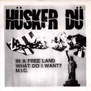
As you can see from the following images, Hüsker Dü had a very identifiable typeface which they used for the logo on all their releases.  This was also regularly accompanied by a sans-serif typeface such as Helvetica and very stark contrasts in colour.


These features are ones that are also found in aspects of modernist graphic design, for example artists such as Josef Müller Brockmann and Experimental Jetset


Bands I would like to have designed album art/packaging for...

Snuff
Leatherface
Iron Maiden
Husker Du
The Beat
The Specials
Mastodon
Propagandhi
...

These are just a few of my favourite artists.

Vinyl Packaging


I am interested in collecting vinyl records, I have a large collection that my parents have passed on to me and I continuing to build a collection of my own. I collect a variety of musical genres but the main part of my collection is Punk from the 80's and 90's.

Vinyl record packaging is something that carries graphic art well and has lots of scope for interesting design.